
You're staring at a hazy sky, wondering whether today's air is behind the migraine that's already stealing your afternoon. To measure air quality for migraine planning, start with the official AQI and PM2.5 reading for your area, then compare it with a consistently placed home sensor and your symptom log. That combination helps you move from guessing after an attack to spotting conditions that may matter before one begins.
Air pollution isn't the only possible migraine influence, and experiences vary widely. But tracking air quality can give you a practical environmental signal to compare with aura, prodrome, photophobia, headache pain, and postdrome symptoms. This article is for informational purposes and is not medical advice. Consult a healthcare provider for personalized guidance.
Table of Contents
Why Air Quality Matters When You Live With Migraine
A migraine can begin before head pain appears. The prodrome may bring fatigue or mood changes, an aura may cause temporary visual or sensory changes for some people, and postdrome can leave you drained after the headache phase. That sequence matters when you compare symptoms with environmental conditions, because the relevant exposure may occur before you recognize an attack.
Air quality is one environmental factor you may choose to track, particularly when fine particulate matter, ozone, or nitrogen dioxide increases. PM2.5 refers to particles with an aerodynamic diameter of 2.5 micrometers or smaller. PM10 includes particles measuring 10 micrometers or smaller. Traffic, combustion, wildfire smoke, industrial activity, and sunlight-driven atmospheric chemistry can change these readings throughout the day. Air-quality standards describe pollutant-specific concentrations, rather than reducing “air quality” to one measurement.
The practical value for migraine planning is timing. Symptoms may appear hours after an exposure, so comparing a later attack with a single daily reading can lead to false connections. An hourly reading gives you a time-stamped record, like a timestamped entry in a calendar. You can compare it with when prodrome, aura, headache pain, or recovery symptoms began.
Start with the official AQI
The U.S. Environmental Protection Agency's AQI reports how clean or polluted outdoor air is. It covers ground-level ozone, particle pollution including PM2.5 and PM10, carbon monoxide, sulfur dioxide, and nitrogen dioxide, as described by the EPA air-quality overview.
Government stations provide the baseline because they use regulated monitoring systems and standardized public reporting. Consumer monitors, smartphone apps, and DIY sensors can add information about conditions near your home, but compare them with the nearest official reading before treating a local number as a reliable planning signal.
A useful routine pairs the official hourly AQI with your symptom record and, when available, a consistently placed home sensor. Relief's approach to symptom and environmental tracking offers one way to consider air quality alongside other logged patterns. The goal is not to label every migraine as pollution-related. It is to build a clearer record for deciding when outdoor activity, ventilation, or other plans may need reconsideration.
The Core Metrics Behind Any Air Quality Reading
A migraine forecast is easier to interpret when you know which measurement sits behind it. Air-quality dashboards commonly track six pollutants, and each responds to different sources and weather conditions. That is why two nearby locations can show different hourly risks.
PM2.5 measures very small particles that can stay suspended in the air and travel with smoke or other pollution. PM10 includes larger inhalable particles, often produced by dust, road activity, and coarse material. Both appear as concentrations, usually in micrograms per cubic meter. For health-guideline context, the WHO Global Air Quality Guidelines provide recommended levels for these pollutants.
Ground-level ozone, or O3, forms when pollutants react in sunlight, so it often becomes more relevant during bright, warm conditions. Nitrogen dioxide, or NO2, is associated with traffic, engines, and other combustion sources. Its level can change quickly near busy roads. Sulfur dioxide, or SO2, is linked to industrial activity and sulfur-containing fuels. Carbon monoxide, or CO, is a gas produced by incomplete combustion.
| Pollutant | Main Sources | WHO 2021 Guideline |
|---|---|---|
| PM2.5 | Combustion, traffic, wildfire smoke, industrial activity | 5 µg/m³ annual mean; 15 µg/m³ 24-hour mean |
| PM10 | Dust, road activity, combustion, wildfire smoke | 15 µg/m³ annual mean; 45 µg/m³ 24-hour mean |
| Ozone, O3 | Sunlight-driven atmospheric reactions | 100 µg/m³ 8-hour mean |
| Nitrogen dioxide, NO2 | Traffic, engines, combustion | Covered by the WHO guideline framework |
| Sulfur dioxide, SO2 | Industrial activity and sulfur-containing fuel combustion | Covered by the WHO guideline framework |
| Carbon monoxide, CO | Incomplete combustion, vehicles, heating, fires | Covered by the WHO guideline framework |
The guideline values use different averaging periods, so they are reference points rather than direct migraine thresholds. An hourly forecast may show a changing concentration, while a guideline may describe an annual or multi-hour average. Keep those time scales separate when deciding whether a number belongs in your symptom log.
Pollutants aren't the same as context signals
Humidity, barometric pressure, temperature, wind, and pollen may appear beside AQI data. They are not pollutants, but they can help explain why an hourly migraine risk forecast changes. Record them separately from PM2.5 or ozone, like weather notes beside a calendar entry, so every dashboard variable does not become a pollution measurement.
Reading the AQI Without Getting Misled
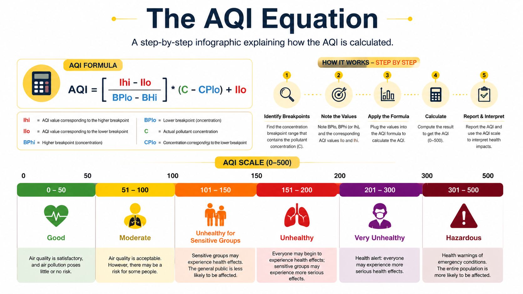
A migraine plan may depend on whether the next hour looks different from the current one. The AQI helps translate pollutant concentrations into a public health communication scale, but it is not a direct symptom forecast. In the U.S. system, the index runs from 0 to 500, with categories ranging from green, Good, through yellow, Moderate, orange, red, purple, and maroon, Hazardous. The EPA outdoor air-quality data guidance describes how monitoring data supports this reporting system.
AQI is not an average of every pollutant. It uses the highest pollutant sub-index, so relatively low particle pollution can still accompany a higher AQI when ozone drives the result. A raw PM2.5 concentration in µg/m³ is also different from an AQI value. The conversion depends on the relevant breakpoint and averaging period, much like converting a temperature reading into a weather alert requires a defined scale and time window.
EPA's AQI framework places AQI 50 at the annual PM2.5 level and AQI 100 at the 24-hour PM2.5 standard of 35 µg/m³. AQI 100 marks the upper end of the Moderate category and the point where caution begins for at-risk groups, according to the EPA's outdoor air-quality data information. The AirNow AQI basics guide notes that an AQI value of 100 generally corresponds to the short-term national air-quality standard for public-health protection.
Use a quick credibility check
WHO's 2021 guideline values are health-based reference levels and may be stricter than national reporting thresholds. A dashboard can therefore label air “Good” while the measured concentration exceeds a WHO guideline. For migraine planning, use the label as a communication aid, not proof that the next hour will be symptom-neutral.
Check five details before changing your plans:
- The pollutant: Identify whether PM2.5, ozone, or another pollutant is driving the AQI.
- The timestamp: Confirm that the reading reflects a recent hour.
- The station: See whether it represents your neighborhood or a distant regional location.
- The averaging period: Keep an hourly concentration separate from an annual guideline.
- The trend: A rising value can matter to an outdoor plan before the category changes.
Practical rule: Record both the AQI category and the pollutant concentration. The category summarizes public communication, while the concentration preserves the measurement you can compare with symptoms later.
Consumer Sensors, Apps, and DIY Approaches Compared
You check the forecast before leaving for work, then notice smoke building indoors while dinner cooks. For migraine planning, the useful question is not which device looks most advanced. It is which source can show the pollutant and time pattern that may affect your next hour.
A home monitor answers a local question: did PM2.5 rise during cooking, or did wildfire smoke enter the room? It usually cannot describe the full outdoor picture. Many consumer devices measure particles and may include CO2, while official networks also track ozone, NO2, SO2, CO, and other regulated pollutants.
Optical particle sensors estimate particle concentration from scattered light. They do not directly weigh particles, and their readings depend on the device algorithm and surrounding conditions, as explained in Honeywell's description of optical particulate-matter sensing. That makes a consumer monitor better for spotting changes than treating every displayed value as a laboratory result.
Smartphone apps often show government-station data. They are useful for regional conditions and hourly planning, but they do not sample the air around you. A DIY build with a PMS5003 or SDS011 gives you control over placement and storage. You also take responsibility for calibration, enclosure design, connectivity, and maintenance.
| Method | Pollutants | Typical Cost | Accuracy vs. Reference | Best Use |
|---|---|---|---|---|
| Official monitoring station | PM2.5, PM10, ozone, NO2, SO2, CO and other regulated pollutants | Not a direct consumer purchase | Regulatory baseline | Outdoor AQI and regional decisions |
| Mid-range consumer monitor | Often PM2.5 and CO2 | $100–$300 | Directional unless tested and calibrated | Indoor particle trends |
| DIY PMS5003 or SDS011 build | Primarily particle estimates | Varies by build | Highly dependent on calibration and conditions | Learning, experimentation, local trends |
| Smartphone app using station data | Depends on the source network | Often no separate sensor purchase | Matches the displayed station data, not your room | Fast outdoor checks |
Low-cost sensors can still support migraine planning, especially when you compare their hourly pattern with symptoms and an outdoor reference. An Environmental Defense Fund evaluation of Breathe London sensors reported calibrated NO2 sensors with a median normalized RMSE of 15% and calibrated PM2.5 sensors with a median normalized RMSE of 33%. Individual PM2.5 collocations ranged from 12% to 83%. Use those findings as a reason to compare, collocate, and calibrate, not to trust a polished display automatically.
Before linking a device or app to health records, review its privacy information to understand how the service handles your data.
Building Your Own Measurement Routine Step by Step
A migraine-planning routine works like a simple dashboard. It combines a stable outdoor reference, one consistent indoor measurement, and symptom notes that share the same timeline. The goal is to see whether an air-quality change repeatedly appears near your higher-risk hours.
Start with a stable outdoor reference
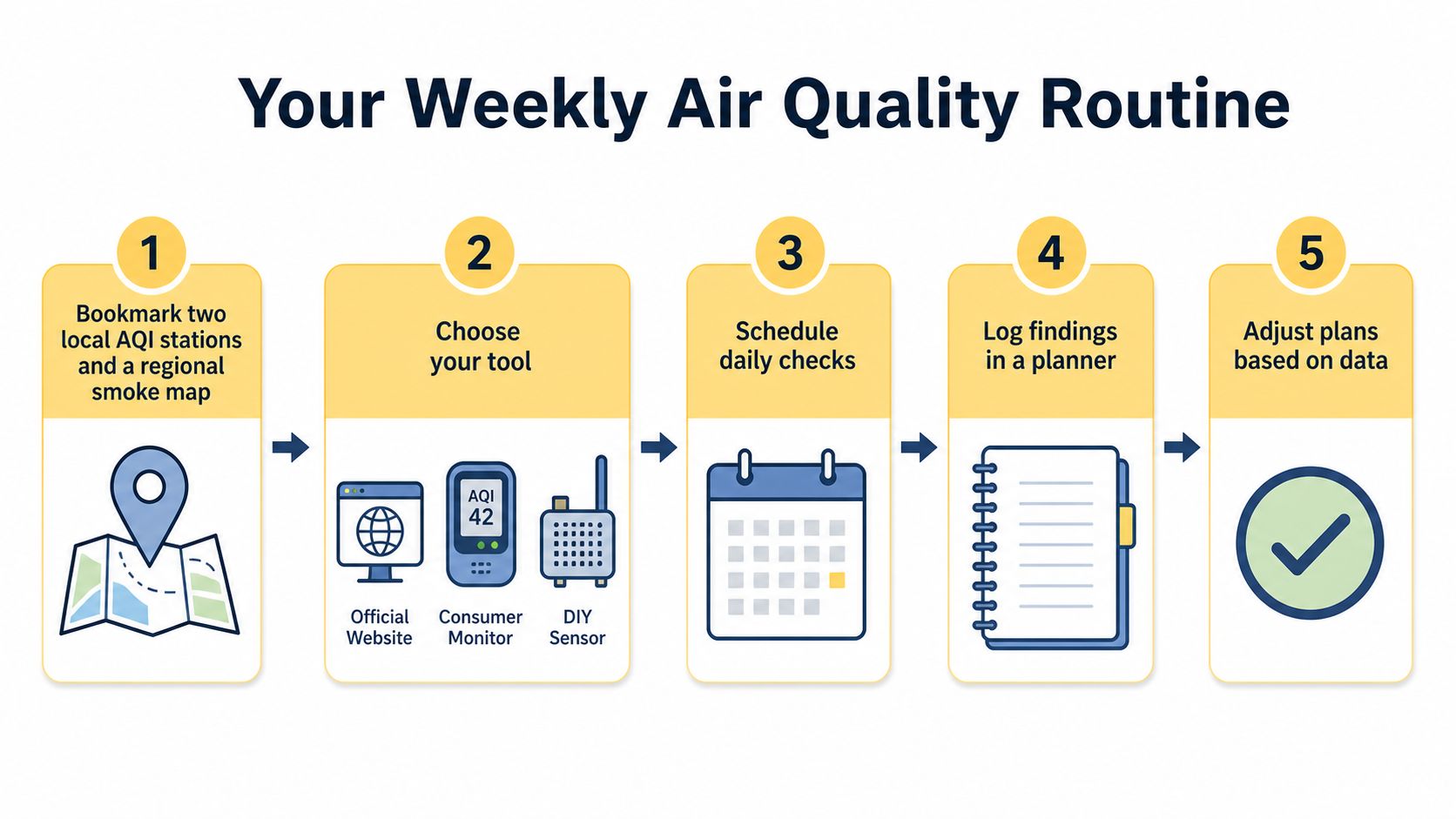
Bookmark the two nearest official AQI stations you can reasonably use. Add a regional wildfire smoke map when smoke is a concern. Comparing stations helps separate a broad regional shift from a condition limited to one location, which makes an hourly forecast easier to interpret.
Choose one home monitor or DIY sensor and keep it in a fixed position, about 1 to 2 metres off the ground. Place it away from windows, kitchens, fireplaces, heating vents, and direct drafts. A bedroom reading and a kitchen reading describe different environments, so moving the device can confuse a change in placement with a change in exposure.
Log the numbers with the experience
Check outdoor AQI and PM2.5 at set points, such as morning, midday, and evening. If the monitor stores continuous data, keep that record. Scheduled checks still provide practical anchors for a journal you can maintain, and they align your notes with the hourly pattern used for planning.
Record these personal fields:
- Symptoms: Note aura, photophobia, nausea, dizziness, neck discomfort, headache pain, and postdrome separately when relevant.
- Timing: Write down when symptoms began, not only when pain became severe.
- Sleep and routine: Include sleep quality, meals, hydration, stress, exercise, and time outdoors.
- Exposure: Mark commuting, traffic, wildfire smoke, cooking, cleaning, and time near an open window.
Review the record after two weeks. Look for repeated timing patterns rather than declaring a universal threshold. A difficult day may involve several overlapping influences, and a personal association does not establish that air quality caused the migraine.
Short, repeatable checks in one location are more useful than scattered readings taken whenever the sky looks unusual.
Accuracy Pitfalls and Troubleshooting Your Data
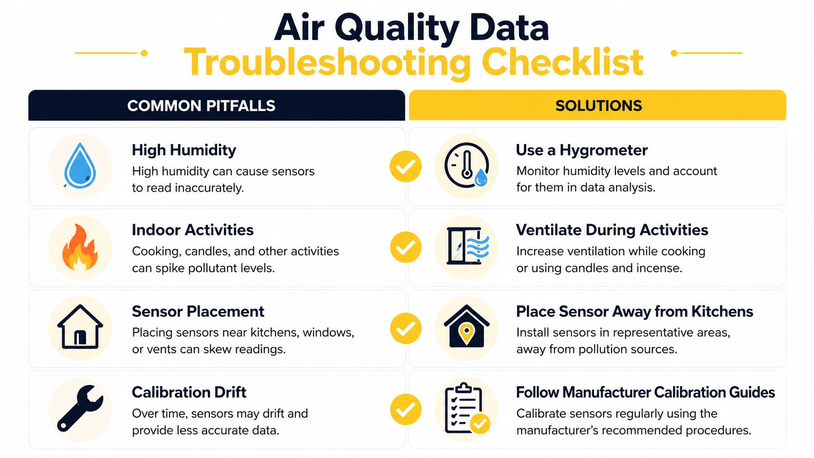
A sensor can show a sudden PM2.5 rise while your actual outdoor exposure has barely changed. Cooking, cleaning, candles, and indoor smoke create real but brief indoor spikes, whereas humidity can make particles appear larger to an optical sensor and inflate its estimate. For migraine planning, label each reading by place and event before treating it as a possible signal in an hourly forecast.
Placement changes the meaning of a number. An outdoor monitor under an eave, beside a busy road, or near an exhaust outlet may capture a local source rather than the air across your area. Keep the reading, but record its exact location and conditions.
Check calibration before trusting a pattern
The EDF Breathe London evaluation used R² greater than 0.7 and nRMSE below 0.5 as QA/QC thresholds for collocation calibration. It found that correlation could stabilize after roughly 7 to 12 days of co-location. A short comparison beside a reference instrument may still miss changes in humidity, temperature, or aerosol composition.
Use this troubleshooting checklist:
- Compare stations: Check your sensor against a nearby official station. Exact agreement is unlikely because locations and instruments differ.
- Watch flat lines: An implausibly unchanged value may point to a connectivity, battery, or sensor fault.
- Log humidity: Record humidity beside PM2.5. In high humidity, above 70%, optical PM2.5 readings can overstate true mass by 20–40%, so a spike may reflect moisture as well as particles.
- Mark indoor events: Note cooking, candles, cleaning, and ventilation changes. Do not treat every indoor spike as outdoor pollution.
- Review calibration: Follow the manufacturer's guidance and record when performance was checked.
A field study found that a low-cost PM reading also depends on the averaging window. Near-real-time readings had a mean absolute error around 4 µg/m³, while annual averages after long-term co-location could fall below 1 µg/m³, as reported in the ACS Environmental Science & Technology Letters study. For migraine planning, use the monitor to identify changing trends and exposure periods, then compare those periods with symptoms. Treat the displayed value as a practical warning signal, not laboratory truth.
Turning Air Quality Numbers Into Migraine Planning
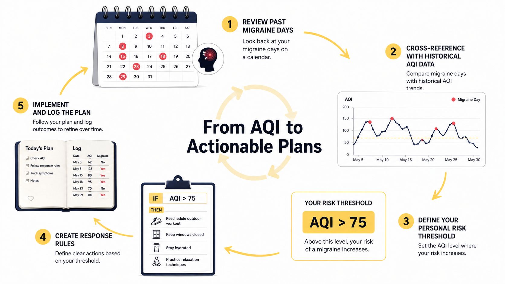
A forecast showing a poor AQI does not automatically predict a migraine. Its value is practical: it can help you decide when to adjust plans, then show whether that choice fits your own symptom history. Start by comparing previous migraine days with hourly AQI and pollutant data. Check whether symptoms followed rising PM2.5, high ozone, smoke, or a combination of air quality with poor sleep, heat, stress, or another exposure.
One attack cannot establish a personal risk threshold. Look for repeated associations, then test a modest response. If a particular hourly pattern often comes before symptoms, try exercising indoors, spending less time beside heavy traffic, closing windows during smoke, or moving demanding outdoor activities to a cleaner hour. An hourly forecast is most useful when it supports a specific decision rather than becoming a warning you monitor without a plan.
Keep medication decisions separate from sensor readings. Use preventive or acute treatments according to your healthcare provider's instructions, not a timing or dosing rule created from an app or monitor. Seek immediate medical care for a sudden severe headache, a headache with fever or stiff neck, new neurological changes, or a headache after a head injury.
Build a weekly review
Once a week, compare three layers:
- Hourly outdoor data: AQI, the pollutant driving it, and the station timestamp.
- Continuous indoor data: PM2.5 changes in the room where you spend time.
- Your symptom journal: Prodrome, aura, headache symptoms, postdrome, sleep, stress, and other possible exposures.
This record helps you check whether outdoor conditions changed before symptoms, whether indoor air followed the same pattern, and whether another factor appeared repeatedly at the same time. A correlation can guide planning, but it cannot diagnose a trigger or replace clinical assessment.
Relief can provide the tracking layer by combining symptom logs with local environmental information, including hourly air-quality inputs. Use Relief to review patterns and plan around periods that have mattered in your history. Treat it as an organizational tool, not medical care.
This article is for informational purposes and is not medical advice. Consult a healthcare provider for personalized guidance.


